C-10: Graph data to communicate relevant quantitative relations (e.g., equal-interval graphs, bar graphs, cumulative records) ©
Want this as a downloadable PDF? Click here!
Target Terms: Equal-interval graph, Bar graph, Cumulative records, Semilogarithmic Chart (Standard Celeration Chart), Scatterplot

Equal-Interval Graph
Definition: Graphs where the distance between two consecutive points on both the X and Y axis represent the same value (e.g., the X axis and Y axis are both intervals of five).
Example of Equal-Interval Graphs: Line graphs, Bar graphs, Cumulative records, and Scatterplots.
Example of Non-Equal-Interval Graphs: Semilogarithmic Charts (Standard Celeration Chart).
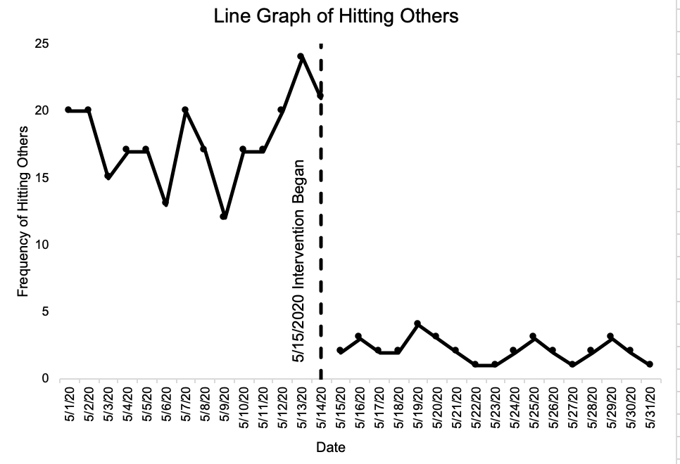
Line Graph
Definition: A graph based on the Cartesian plane where a two-dimensional area is formed by the intersection of two or more lines forming a data path.
Example in a clinical context: A behavior analyst creates a line graph that displays baseline data and intervention data on the target behavior of hitting others.
Why it matters: Line graphs should be used when you want your data to communicate quantitative relations such as time or the order of responses in a sequence. Line graphs can include multiple data paths for different behaviors.
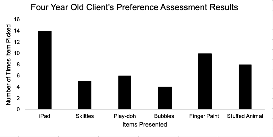
Bar Graph
Definition: A graph based on the Cartesian plane where there are no distinct data points representing responses through time.
Example in a clinical context: A behavior analyst displays data from a preference assessment that was conducted with a child.
Why it matters: Bar graphs are used to display a set of data that are not related to each other.
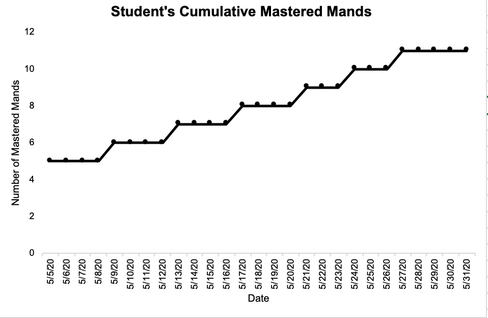
Cumulative Records
Definition: A graph that displays the cumulative number of responses emitted are represented on the vertical axis, where the steeper the slope of the response the greater the response rate.
Example in a clinical context: A teacher is conducting a manding program with a student and uses a cumulative record to display the student’s mastered mands.
Why it matters: Cumulative records demonstrate response frequency over a period of time, which helps to quickly conceptualize the rate at which a learner is gaining new skills.
Semilogarithmic Charts (Standard Celeration Chart)
[Example SCC coming soon!]
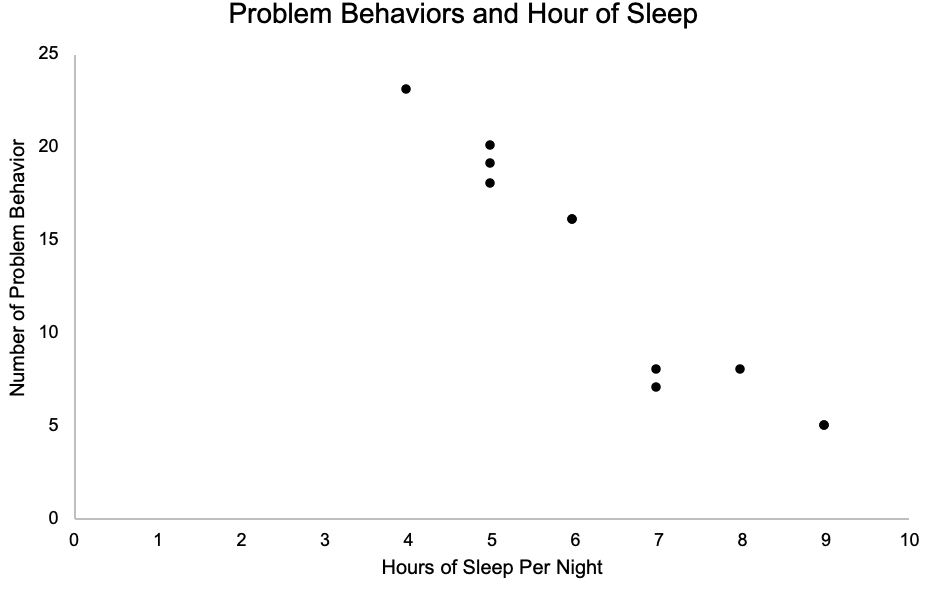
Scatterplot
Definition: A graph that shows the relative distribution of individual measures in a data set (e.g., aggression, sleep, etc.).
Example in clinical context: A behavior analyst creates a scatterplot of a client’s aggressive behavior to determine any temporal patterns between aggression and time of day.
Why it matters: Scatterplots communicates temporal relations of a behavior of interest if one exists.